As Interior Designers we at Aspinall Creative talk a lot about colours, and in particular – the colour wheel.
It’s an expert tool that helps us complete your renovation and redesign to the highest standard, but how exactly does a wheel of colour help you do that?
To help you understand what the colour wheel is and how to use it effectively, we’ve created a useful guide that explains everything you need to know.
What is the colour wheel?
It’s a wheel of colour that shows all the different colours of the colour spectrum aka the colours of the rainbow.
It displays the relationship between each of those colours in a visually clear way and can help anybody, not just interior designers like us, know which colours go together.
Colours of the rainbow
As mentioned above, the colour wheel includes the colours of the rainbow – however, it’s initial creation extends beyond that.
It’s based around the three Primary Colours – red, yellow and blue. These are primary colours because you can’t mix any colours together to create these BUT you can mix these colours together to create new ones…
These newly mixed colours are then called Secondary Colours. When you mix together blue and yellow you get green, when you mix yellow and red you get orange and of course when you mix red and blue you get purple.
You can then mix these Secondary Colours together to create even more colours known as Tertiary Colours such as red purple, red orange, blue purple, blue green, yellow green and yellow orange.
All of these colours essentially make up the colour wheel that you might be more familiar with.

Complementary Colours
You may often hear designers referring to complementary colours, and these are colours on the colour wheel that naturally go together.
The reason they suit one another is actually because they are opposites. If you look at the wheel, you’ll see that blue and orange are opposite one another, as are yellow and purple and also red and green.
These pairs of colours and their respective hues are known as Complementary Colours.
The darker the hue of one shade, the darker the other should be to match i.e. a deep raspberry colour will look better with a deep forest green as opposed to a highly saturated lime green.
Analogous Colours
These colours are the colours next to your chosen colour on the wheel. This can take many formats, and is mostly used for bolder colours that need an extra hint of colour to complete the design.
In practice, this could look like using a purple as the main focus colour, and then adding finishing touches and swatches of a lighter and softer blue paired with a rich navy.
The idea here is to use similar colours that pair well together and create a calming comforting interior design. If you’d like to know more about this technique and how to implement it into your design – get in touch!
Other Colour Schemes
There is an abundance of other colour profiles and formats that can be used to bring your interior space to life, though these are the most common formats used to ensure your design delivers on your main goals.
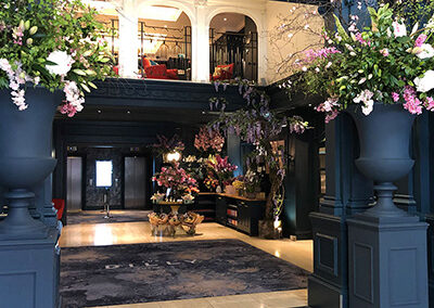
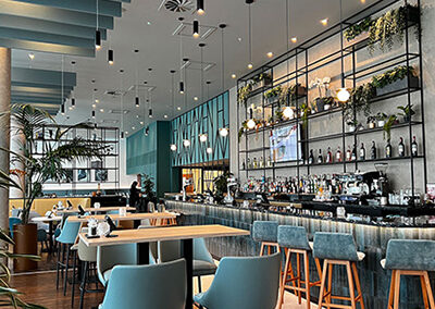
We work with you to ensure that whether you’re looking for a harmonious space to help guests unwind, an inviting lobby area to ensure guests feel comfortable and welcome or something a little more vivid to energise your visitors the colour scheme helps to reflect that goal.
Additional Rules
Sometimes the rules of interior design go further than picking a colour scheme or theory and below are some of our top quick fire tips we use to ensure we get the most out of our interiors.
Add Accent Colours
When using placid swatches such as black and grey, it’s important to add a contrast colour that includes warmth and feels natural.
A great example of this is to incorporate accent colours such as yellow, orange or green.
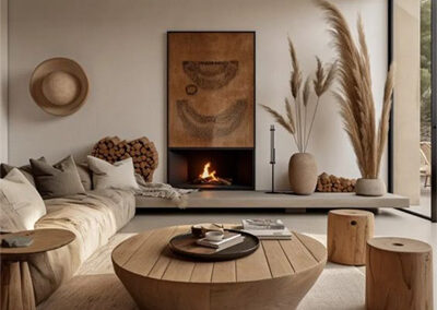
Pairing Neutral Colours
When using neutral colours such as beige and brown, these colours are welcoming and strong enough to be layered up together.
This falls into the Analogous Colours we mentioned earlier and can be an excellent way to keep your scheme stripped back whilst still remaining interesting on the eye.
Monochromatic
Using monochromatic colours doesn’t just mean black and white. It can also mean using different hues of the same colour i.e. a purple room could be a mix of plum, mauve and lilac and a green room could be forest, hunter and olive.
Using lighter tones will help your space feel open and airy, whereas darker tones will create a more dramatic effect. The overall benefit of using colour schemes like this is that they’re typically considered to be relaxing and serene, perfectly suited for bedrooms and social areas where you want visitors to remain and unwind for a while.
Choosing the right scheme for you
Ultimately the colour scheme you decide upon for your interior design renovation depends upon your overall goal.
Our team at Aspinall Creative will work with you to utilise the elements of the colour wheel and ensure that the scheme you choose is the perfect solution for your plans.
Get in touch with us today to find out more.